Companies pour significant budget into traffic — paid ads, SEO, email campaigns — and then hand visitors a landing page that was built in a hurry and last updated three years ago. The result is a predictable waste: the traffic costs are real, but the conversions are not.
This article is not about landing page theory. It is about the specific design and content decisions that research consistently shows have the highest impact on whether a visitor takes action — and the ones that do not matter nearly as much as you might think.
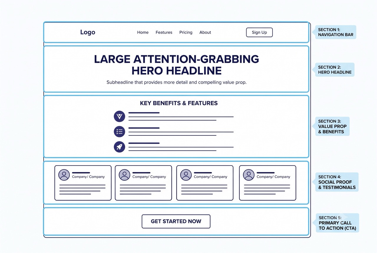
The Headline Does Most of the Work
Studies of user behavior consistently show that visitors make a decision about whether to stay within the first few seconds of landing on a page. During that window, the element they process first — and most carefully — is the headline.
Not the hero image. Not the brand. The headline.
A high-converting headline does three things simultaneously:
- Identifies who the page is for. The visitor should immediately recognize themselves in it.
- States a specific outcome. Vague promises lose people. Concrete results keep them.
- Removes the biggest obvious objection. If the reader is thinking “that sounds too slow” or “that sounds too expensive,” the strongest headlines address it directly.
Most landing page headlines fail because they describe the product or service instead of the outcome the visitor actually wants. “Professional Web Development Services” tells you what the business does. “A website that earns more than it costs to build” tells you what you get.
“Visitors do not buy products. They buy better versions of their current situation. Your headline should reflect that.”
What “Above the Fold” Actually Means Now
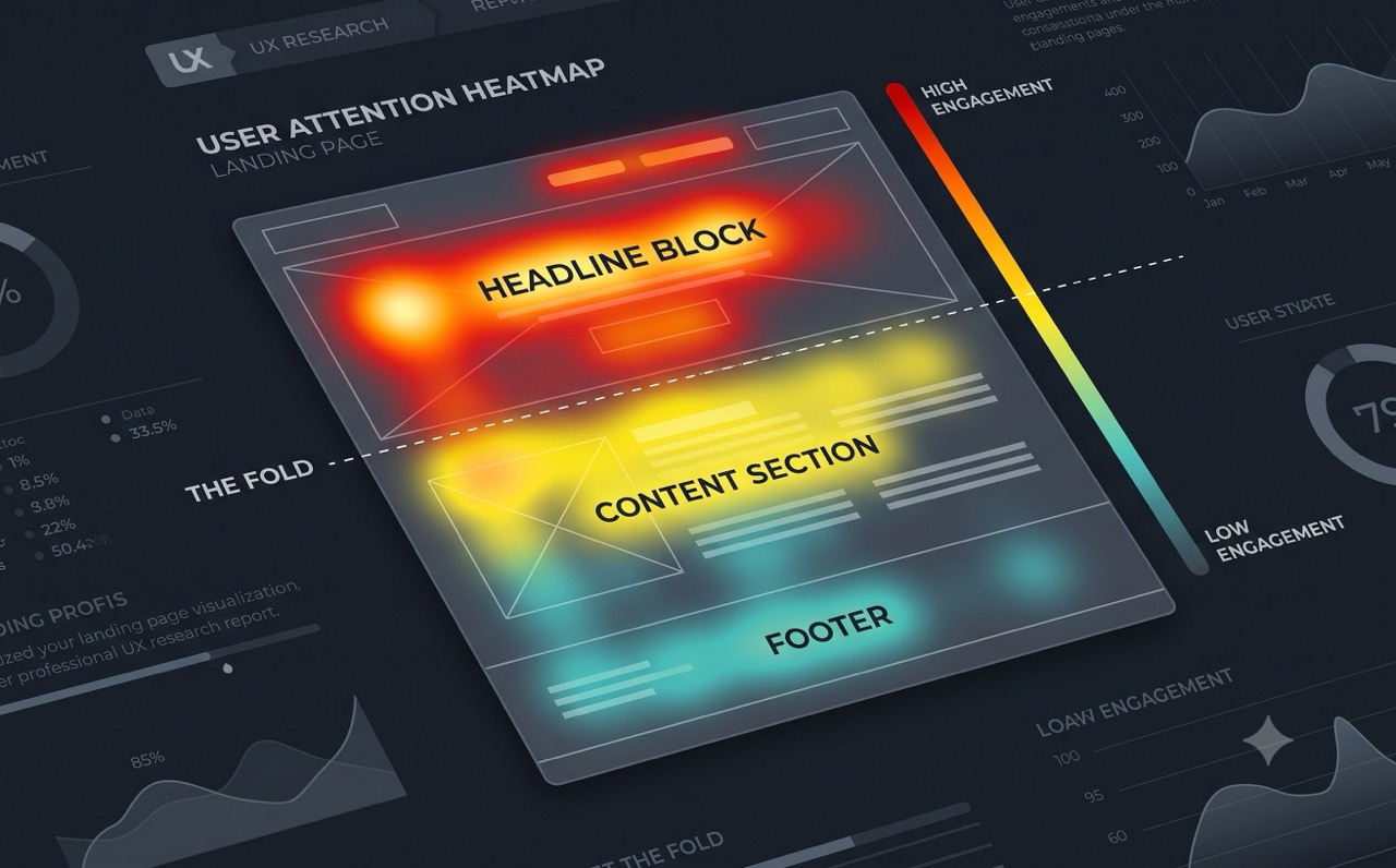
The classic rule — put everything important above the fold so users do not have to scroll — was built on research from an era of standard desktop monitors. Scrolling behavior has fundamentally changed. Users today scroll readily and willingly. What the fold still governs is not what they see — it is what they decide.
Visitors do not scroll further unless the content above the fold persuades them it is worth continuing.
That means the area above the fold needs to answer three questions clearly and quickly:
- What is this? (The product or service being offered)
- Who is it for? (The specific type of person or business it helps)
- Why should I care? (The primary benefit or outcome)
Everything below the fold then exists to handle objections, provide evidence, and guide the visitor toward the call to action.
Social Proof: What Research Actually Shows
Social proof is one of the most powerful conversion tools available — but its effectiveness depends almost entirely on specificity. Generic proof is nearly worthless. Specific proof is highly persuasive.
What does not work well:
- Star ratings with no accompanying text
- Testimonials that say “great product, highly recommend”
- Client logos with no context about what the relationship produced
What works:
- Testimonials that describe a specific problem, a specific solution, and a measurable result
- Case study numbers tied to a recognizable business type (“a 12-person e-commerce team reduced cart abandonment by 18% in three months”)
- Social proof that matches the identity of the visitor — a B2B buyer is more persuaded by similar B2B results than by consumer reviews
Placement matters as much as content. Social proof is most effective when it appears at or near the primary call to action, not buried at the bottom of the page as an afterthought.
The Call to Action: Copy, Design, and Placement
Most CTA advice focuses on button color. Button color is one of the least important factors. What actually moves conversion rates:
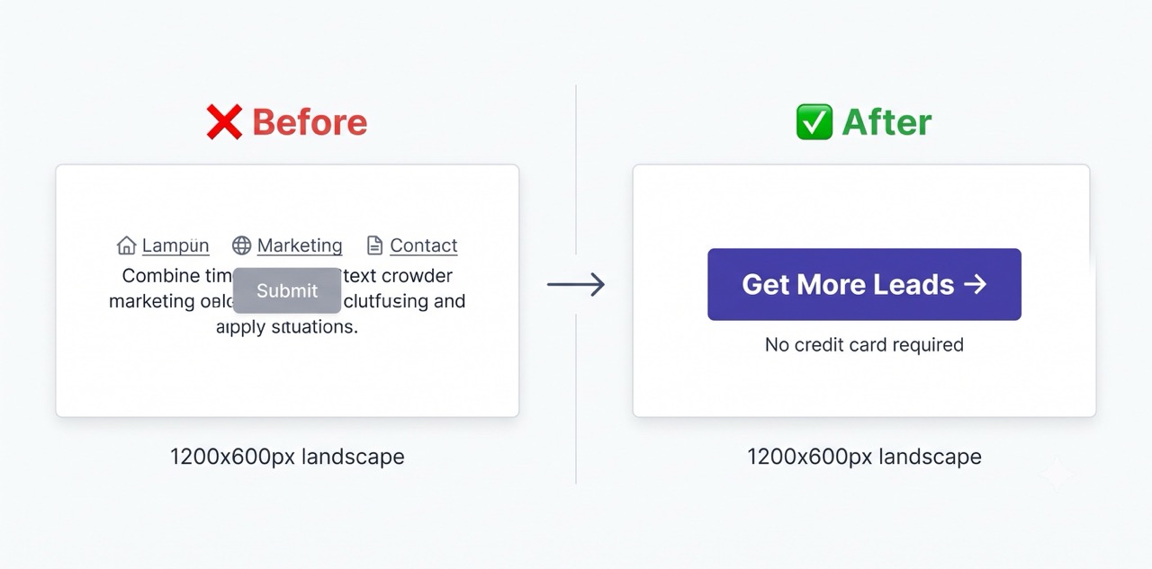
Copy that describes the outcome, not the action. “Get started” is an action. “Start getting more leads” is an outcome. When visitors can see what happens after they click, resistance drops significantly.
Visual isolation. The CTA button needs enough surrounding whitespace that it does not compete with nearby text or images. Every element near a CTA that draws attention away from it costs you conversions.
A single primary CTA per page. Multiple competing calls to action — “Sign up,” “Watch the demo,” “Talk to sales,” “Read the blog” — split attention and reduce the probability of any single one being clicked. Choose the one action most valuable for this specific page and remove the rest.
Placement above and below long sections. On longer landing pages, the CTA should appear near the top for visitors who are already decided, and again after each major section for visitors who need more evidence before acting.
Mobile Is Not a Variant. It Is the Default.
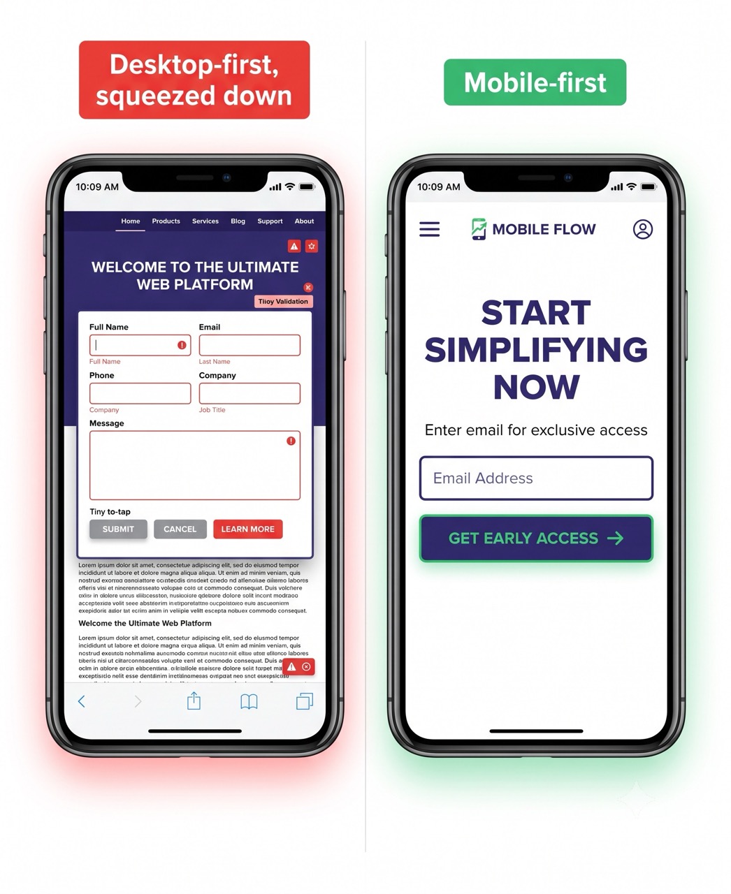
For most businesses, more than half of landing page traffic now arrives on a mobile device. In e-commerce and consumer services, that share is often closer to 70–80%. A landing page designed for desktop and then “made responsive” is not a mobile page — it is a desktop page that has been compressed down.
The differences that matter most:
- Touch targets must be large enough to tap accurately. Buttons under 44px tall are regularly missed on mobile, which registers as a failed interaction even when users do not consciously understand why they feel frustrated.
- Forms must be short. Every additional field reduces completion rates. On mobile, the reduction is steeper because typing is slower and more error-prone. Collect only what is genuinely necessary to take the next step.
- Load time is more critical on mobile than on desktop. Mobile connections are slower and more variable. Research from Google consistently shows that pages loading in under 2 seconds on mobile convert significantly better than pages loading in 4 or more seconds.
The Speed Problem Most Teams Ignore
A well-designed landing page that loads slowly is still a badly performing landing page. Speed is not a purely technical concern — it directly affects the number of visitors who stay long enough to read anything on the page.
Every additional second of load time costs you visitors before your headline has a chance to do its job. Compressing images, using fast hosting infrastructure, deferring non-critical JavaScript, and choosing a framework that is built for performance are technical decisions — but they are also conversion decisions.
Pulling It Together
If you are evaluating an existing landing page — or building one from scratch — here is the priority order to apply your attention:
- Headline clarity — does it identify the visitor, state a concrete outcome, and address an obvious objection?
- Above-the-fold messaging — do the three core questions (what, who, why) get answered without scrolling?
- Social proof specificity — does the proof feel genuinely relevant to the type of visitor this page targets?
- CTA strength — is it outcome-focused, visually isolated, and placed at each natural decision point?
- Mobile experience — was the page designed for mobile first, or compressed from a desktop layout?
- Page speed — does it load in under 2 seconds on a mid-range mobile connection?
Most underperforming landing pages have a clear failure in the first two or three items on this list — long before questions of color, typography, or visual style become relevant.
At WebCode Studio, we design and build landing pages around conversion as a primary engineering goal — not an afterthought. If your current page is driving traffic but not leads, let’s look at it together.